Website
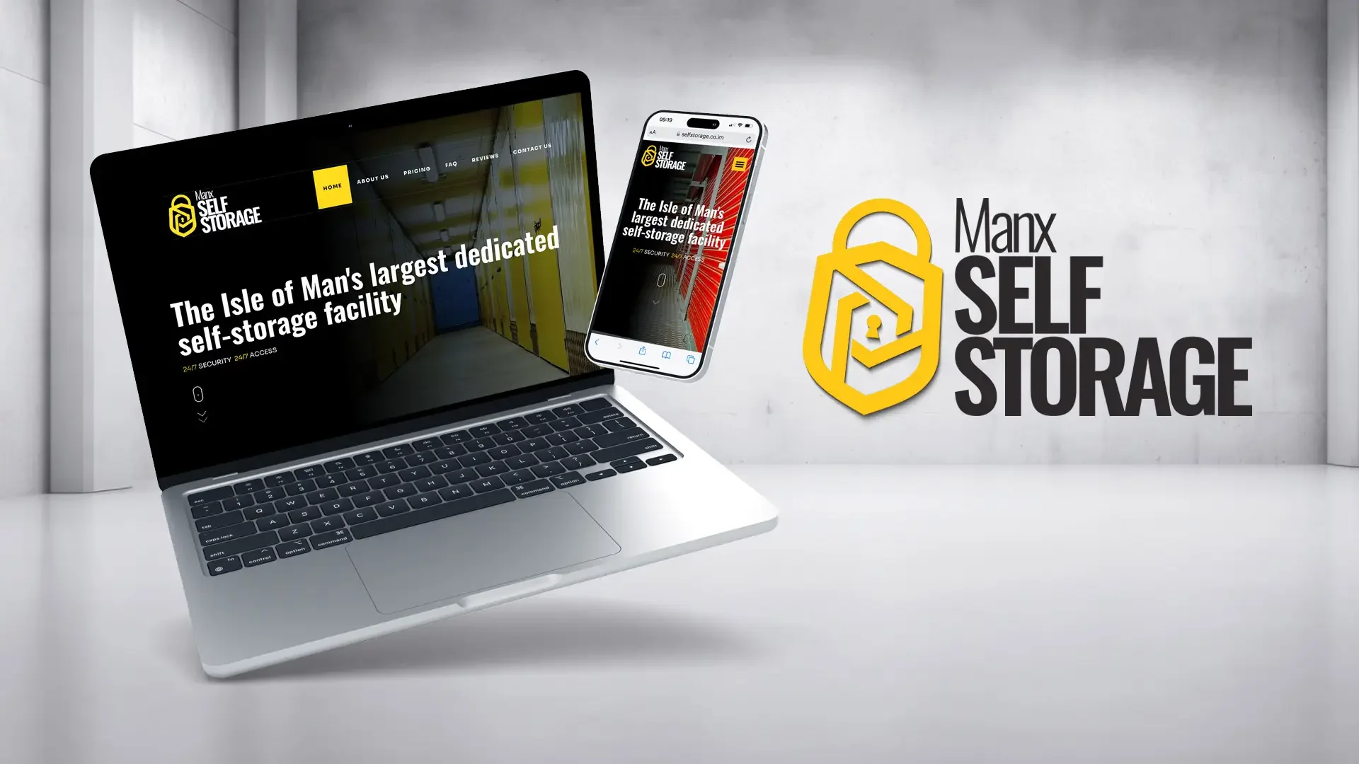
The brand's digital home, carrying the identity into every screen and interaction.
A complete rebrand turning an established storage operator into a confident, coherent customer-facing business.
The brief
Manx Self Storage had the experience, facilities and scale of an established operator, but its identity and website no longer reflected the business it had become. The brief was to create one clear brand that could command attention online, from the road and across both storage sites.
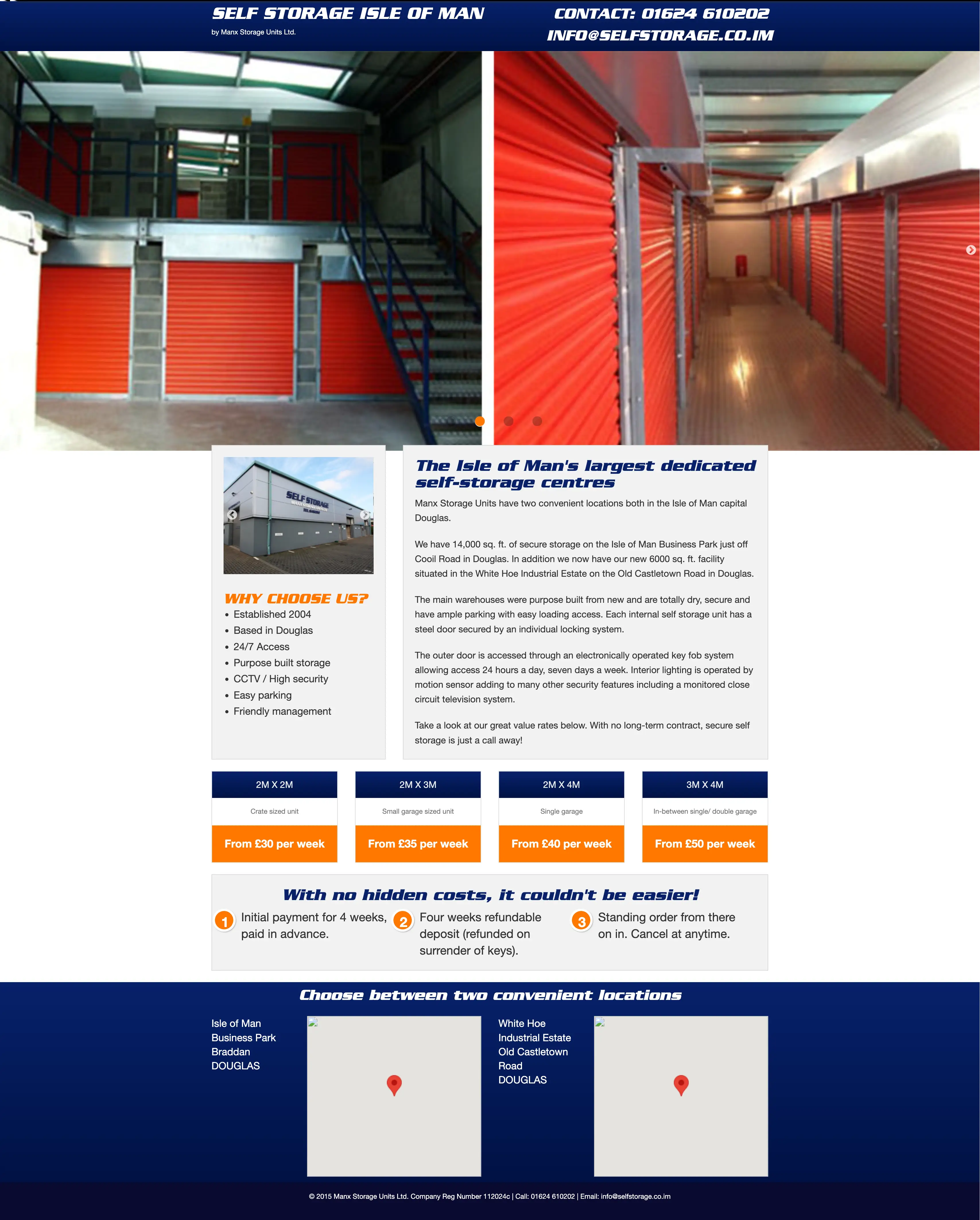
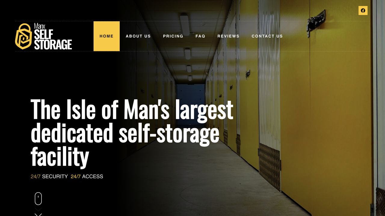
Website before & after
The original website placed the entire business on one long landing page. It contained the essential information, but its dense layout, limited hierarchy and desktop-first presentation no longer matched customer expectations. The new site gave the business a clearer proposition, stronger navigation and a responsive experience that made pricing, facilities and enquiry routes easier to find.
The new identity
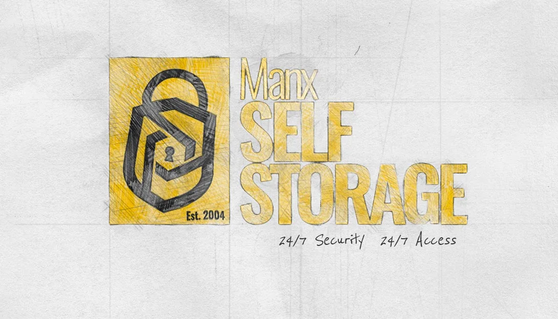
The new mark combined a padlock, storage unit and keyhole into one distinctive device. Strong condensed typography and a high-contrast yellow and black palette made the business instantly recognisable, whether seen on a phone, a vehicle or from across the road.

One connected brand
A rebrand only becomes real when it leaves the presentation. The same identity was carried from the smallest digital details to vehicles and large-format building signage, creating one consistent presence across every customer touchpoint.
The brand's digital home, carrying the identity into every screen and interaction.
A mobile brand presence designed to be recognised quickly on the road.
High-impact external graphics that identify the business and its locations.
Consistent colour, typography and messaging throughout the customer experience.
The result
Prospective customers can now recognise the business, understand the offer and find the next step more quickly. The rebrand gives an established operator a presence that matches its scale without losing the straightforward, practical character customers value.
Work with us