Bohemian Coffee House: character in every cup.
A richly crafted identity that gave an independent coffee house the warmth, wit and confidence to stand apart.
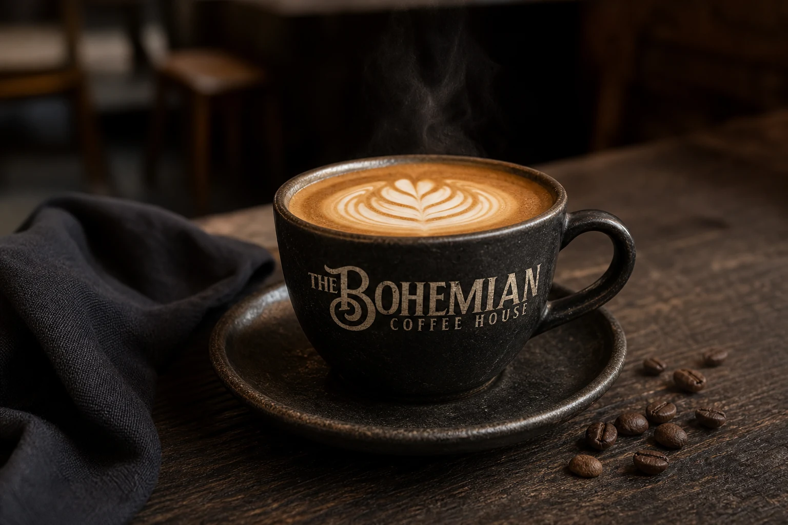
The brief
Bohemian Coffee House needed a memorable identity with the warmth of a familiar neighbourhood café and enough personality to feel unmistakably its own. We built the system around expressive letterforms, a wonderfully eccentric Victorian cyclist and a restrained palette designed to gain character over time.
The identity
A little eccentric. Completely ownable.
The sweeping initial gave the name immediate presence, while the penny-farthing gentleman added charm without turning the brand into a novelty. Together they created a flexible signature that worked as a full lock-up or a compact mark.

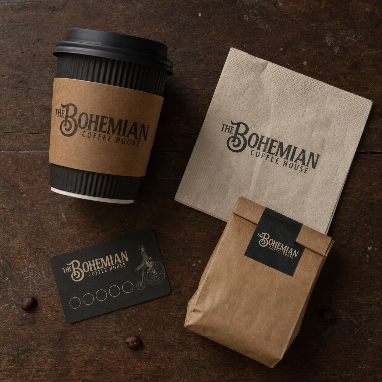
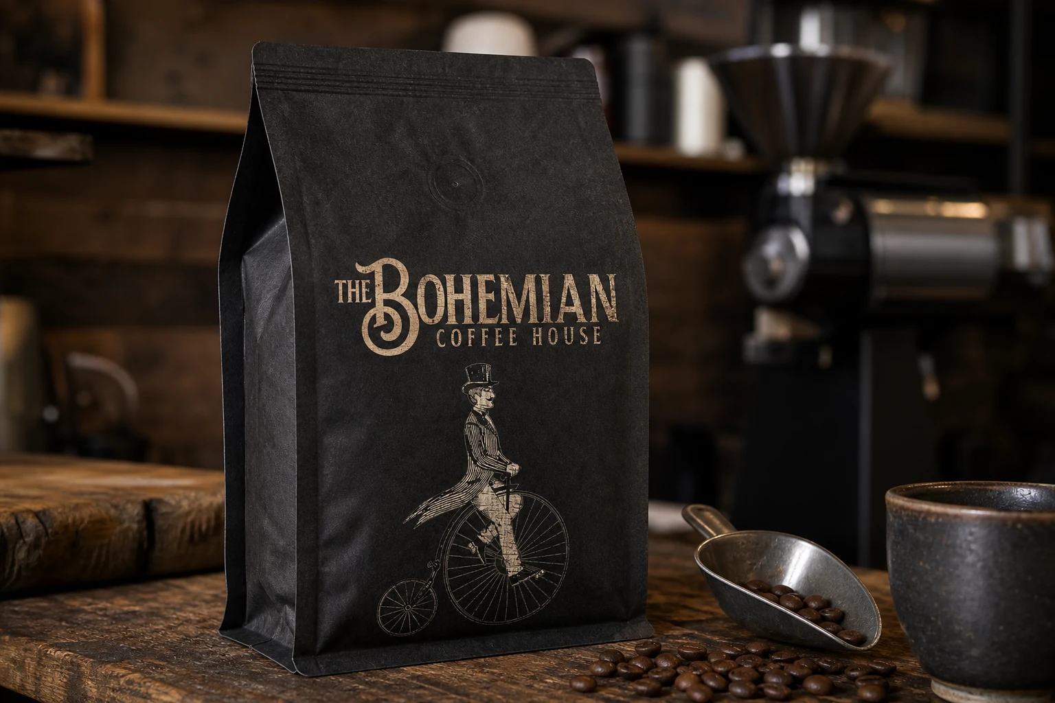
The identity in context
Made for coffee‑house moments.
Shown across familiar coffee-house touchpoints, the identity felt entirely at home. Warm cream, black and natural kraft demonstrated how the logo carried its character from the counter to takeaway moments with clarity and consistency.
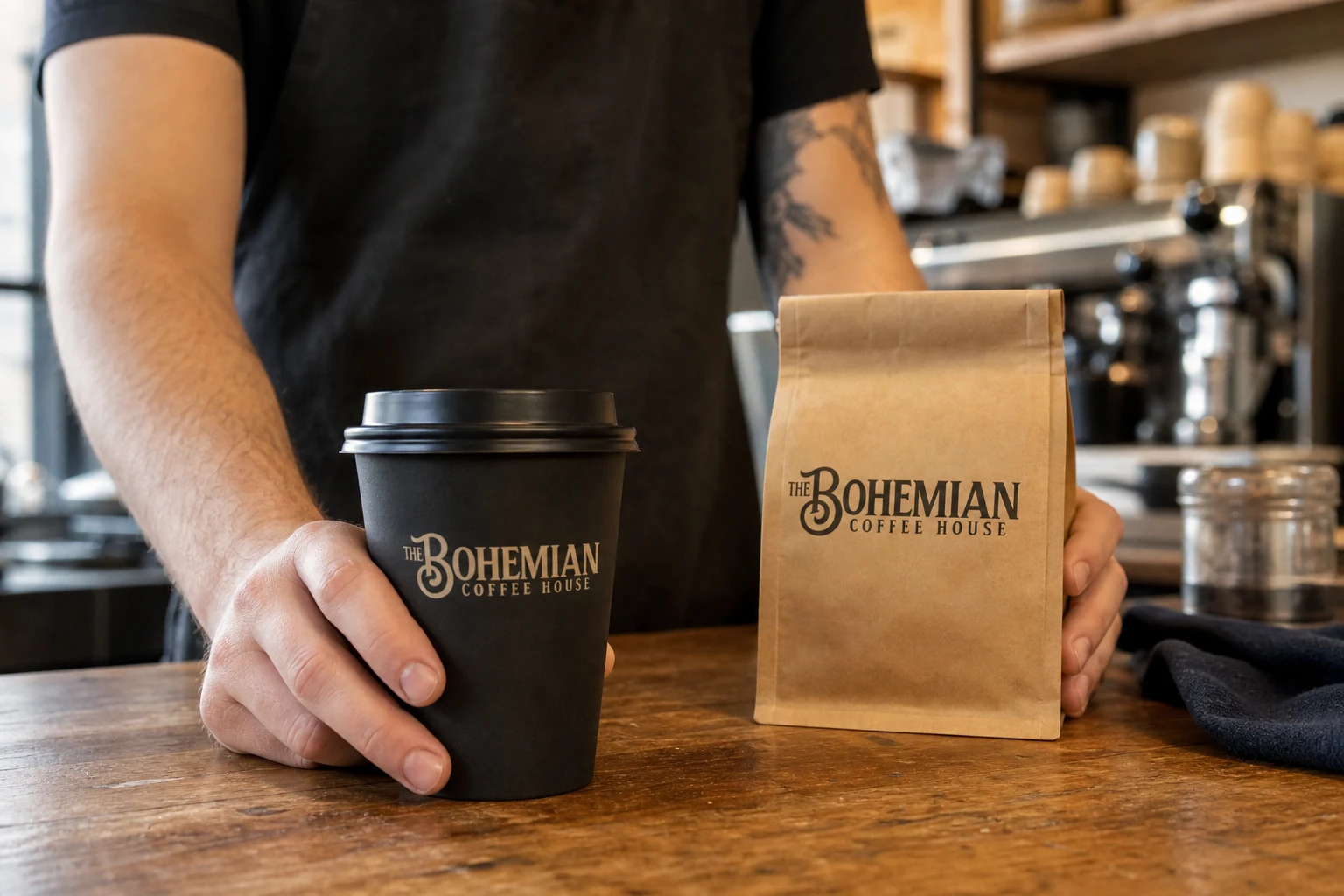
The system
Distinctive wherever it lands.
A compact set of recognisable elements gave the identity the flexibility to feel at home across the practical touchpoints of a busy coffee house.
- A memorable typographic signature with a flexible illustrated character
- A restrained black, cream and kraft palette suited to tactile café materials
- A flexible identity with clear potential across cups, bags and counter‑side touchpoints
- A visual character that felt established rather than manufactured