Ballacamaish Farm Cottages: quietly contemporary.
A complete rural identity shaped around a simple promise: a hidden home from home.
The brief
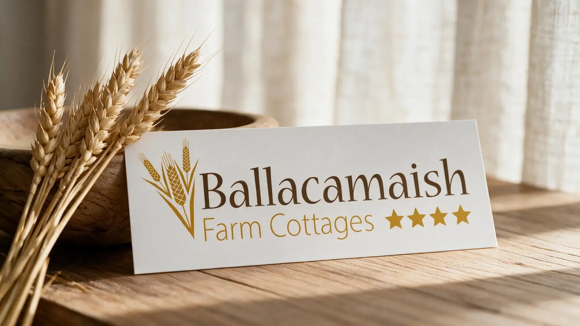
Ballacamaish's converted stone barns needed a brand that balanced rural character with the comfort and clarity of contemporary self‑catering accommodation. We developed an elegant wordmark, wheat motif and olive and gold palette, then carried the identity through interior photography, signage and printed materials.
The identity
Rural character, carefully composed.
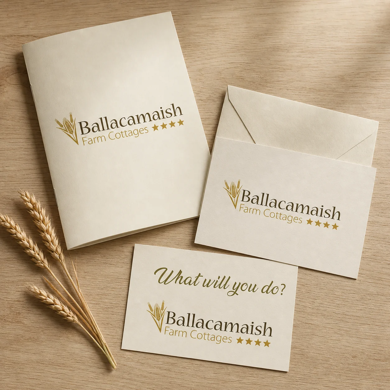
The wheat motif gave the brand an immediate connection to the land, while the classic typography brought poise and permanence. Warm cream, olive and soft gold created a flexible visual language across printed and environmental pieces.
The trifold
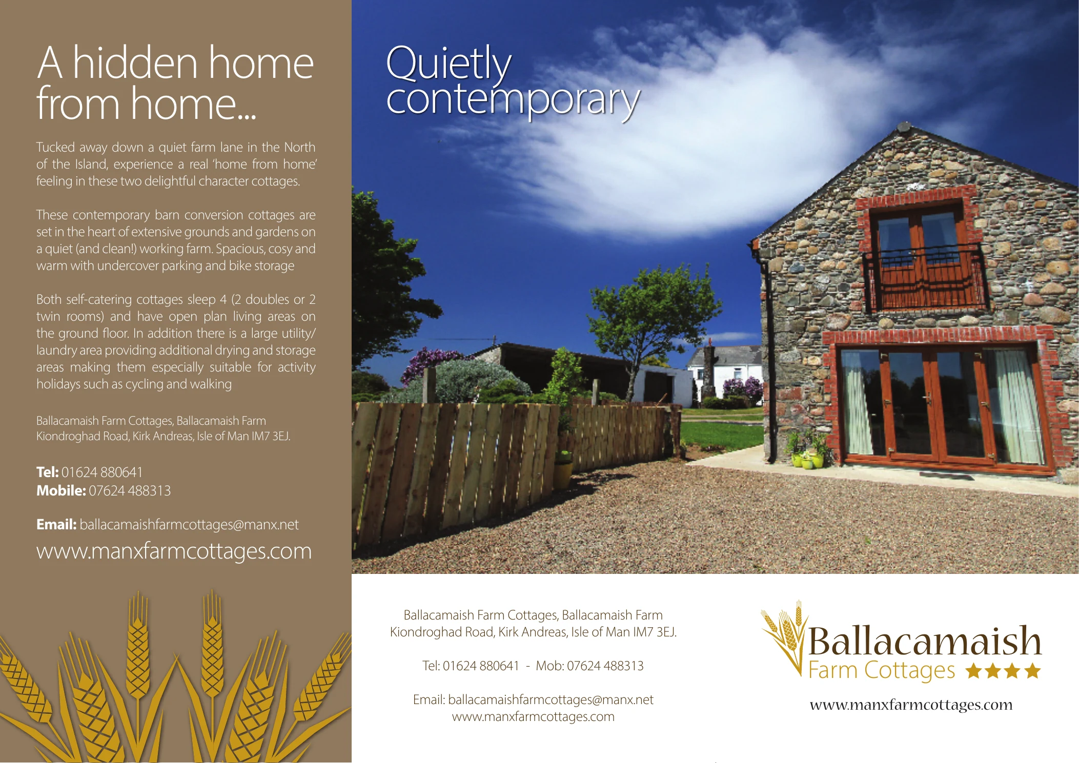
A hidden home from home.
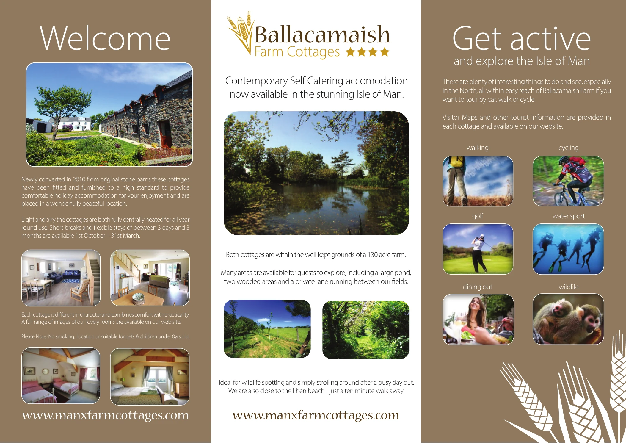
The flyer gave the brand a fuller voice. Its outer panels introduced the cottages as both homely and “quietly contemporary”. Inside, the story moved from a warm welcome and interior photography to an invitation to explore the Island, creating a useful rhythm from reassurance to possibility.
The campaign
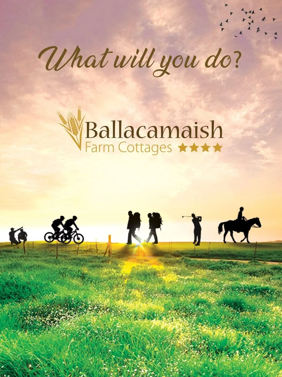
What will you do?
The wider campaign carried that invitation forward. “What will you do?” and the flyer’s “Get active and explore the Isle of Man” created an energetic counterpoint to the peaceful accommodation story, presenting the cottages as a welcoming base from which to enjoy the Island.
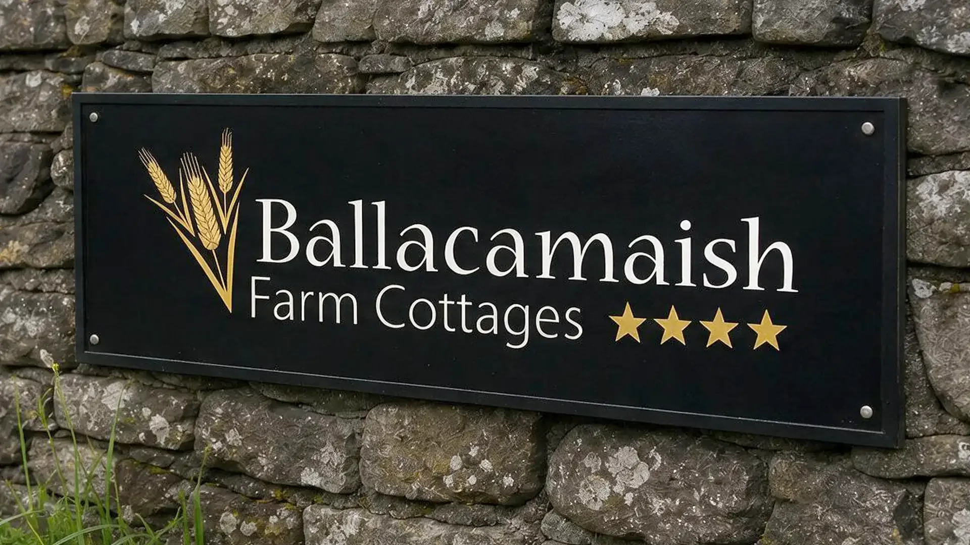
Interior photography, signage design and print materials all extended the same calm, natural character, giving the brand a consistent sense of place.
The feedback
“TTS are a breath of creative fresh air and elevate the project far beyond the client’s original expectations. A real gem of a business.”
Ballacamaish Farm Cottages