Philip Charles Kitchens: an identity made to be seen.
A refined logo and non‑destructive exterior wrap that gave the business a clear and confident presence.
The brief
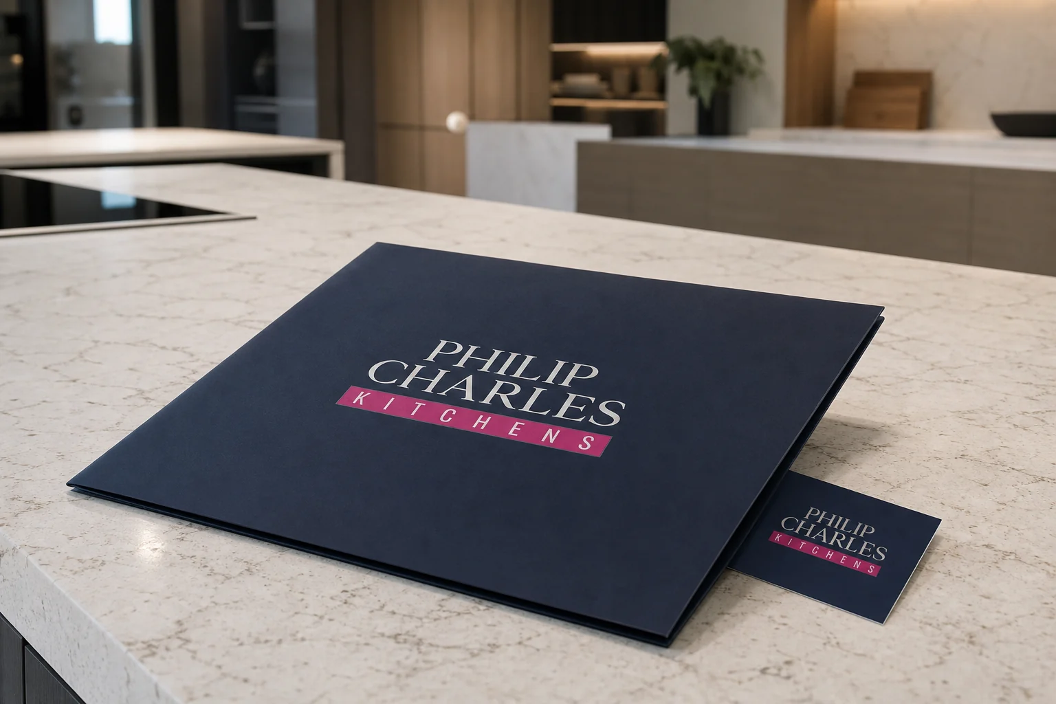
Philip Charles Kitchens needed a distinctive logo and a strong visual presence for the exterior of its building. We created a composed identity using strong serif typography, deep navy and a decisive magenta accent, designed to feel established, precise and clear within a busy retail setting.
The identity
Classic structure. Contemporary confidence.
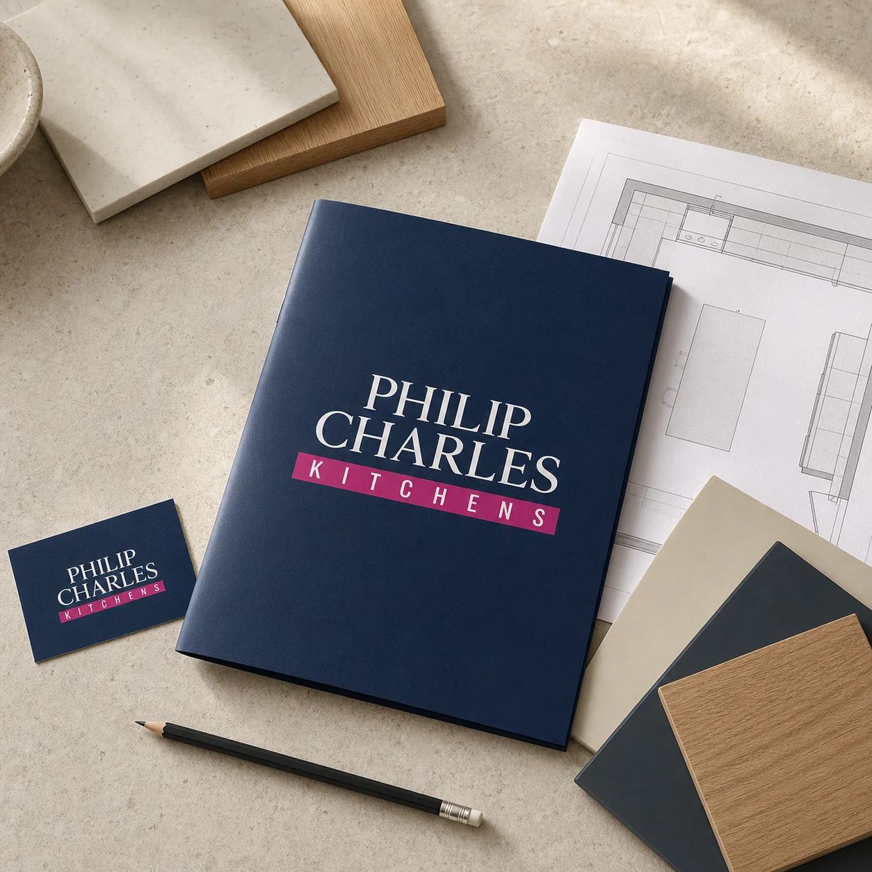
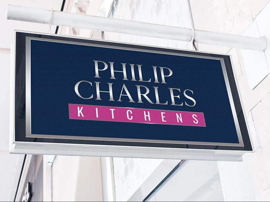
The stacked wordmark created a strong, architectural silhouette. A slim magenta panel gave the kitchen descriptor immediate visibility, while navy provided a calm foundation that worked clearly at different sizes and in different settings.
The exterior
A practical solution with real presence.
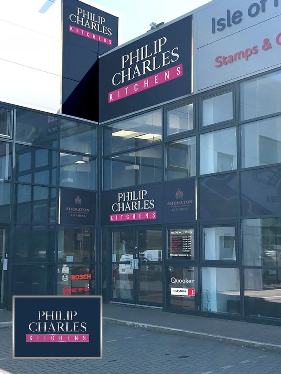
With the logo established, the next task was to apply it to the outside of the building. Restrictions meant the existing exterior could not be altered destructively, so we used a non-destructive vinyl wrap to carry the navy and magenta identity across the façade while leaving the structure untouched.
The brand in context
A natural setting for the identity.
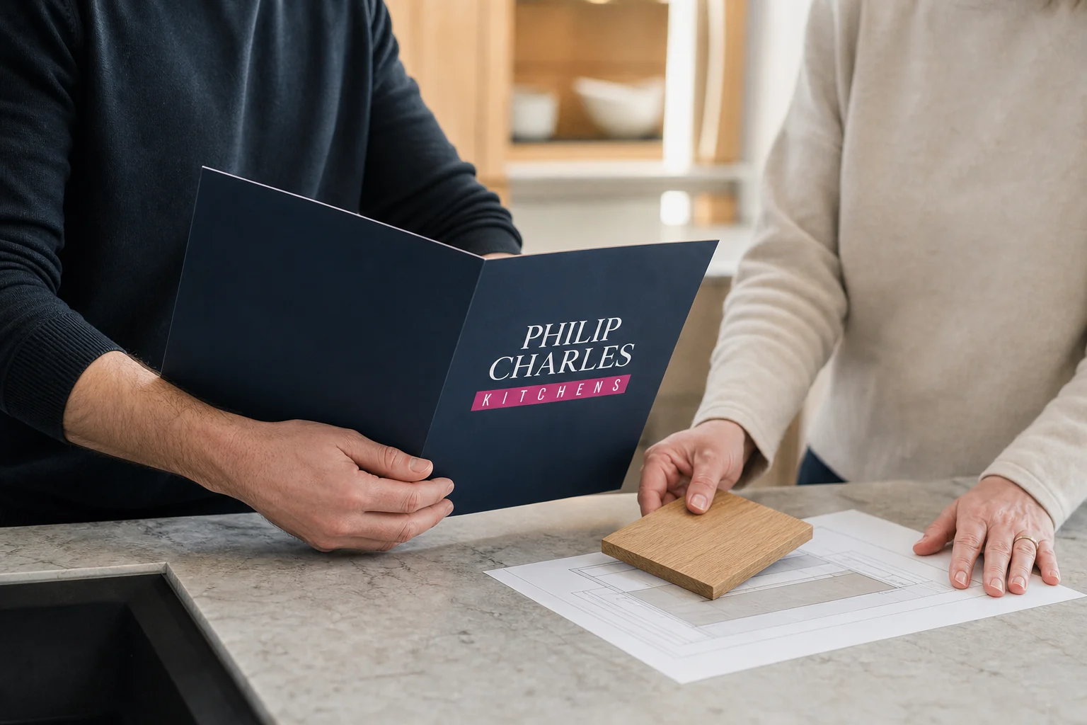
Shown within a contemporary kitchen setting, the identity felt entirely at home. Deep navy, crisp typography and the confident magenta accent brought a clear sense of quality and character to the brand.
The feedback
“I cannot recommend Mark at TTS highly enough, he ingeniously navigated building regulations by wrapping our entire facia in non‑destructive vinyl! The end result is exactly what we wanted, I would not hesitate to recommend him.”
Philip Charles Kitchens